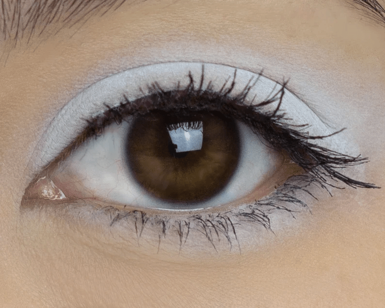
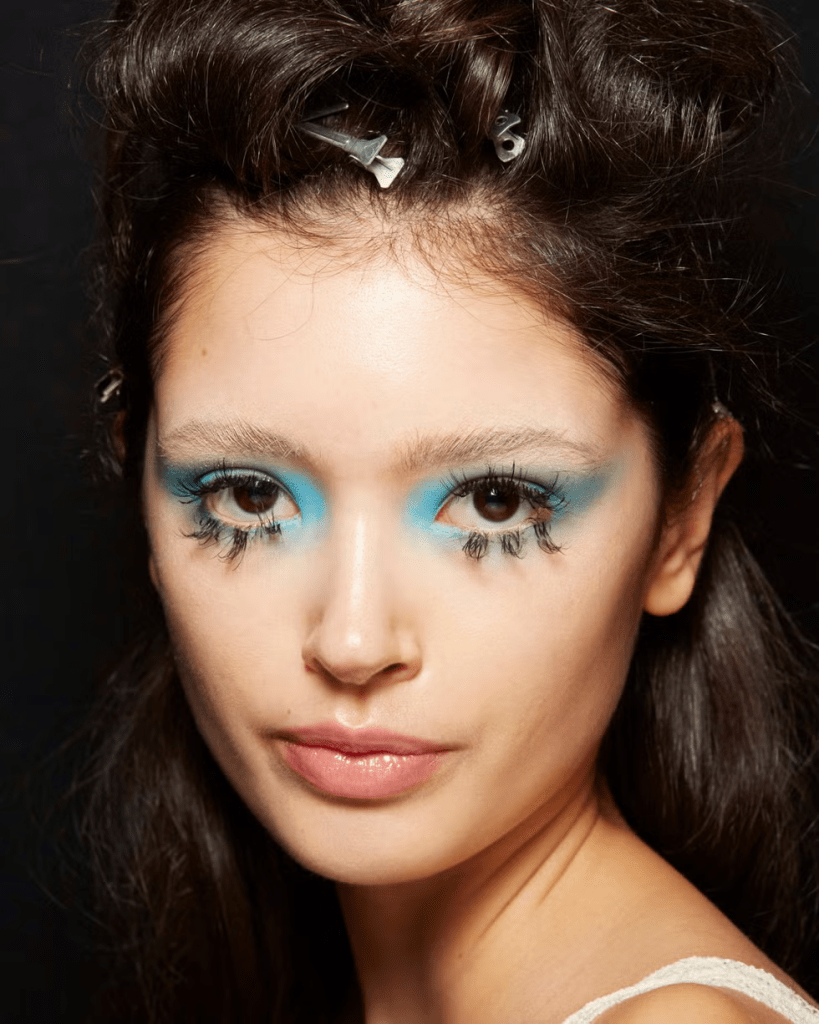
I look terrible with dark eyeshadow, especially underneath, so this explains why.
The dark one is how Sybil Faulty was wearing it so might have got a clue here.
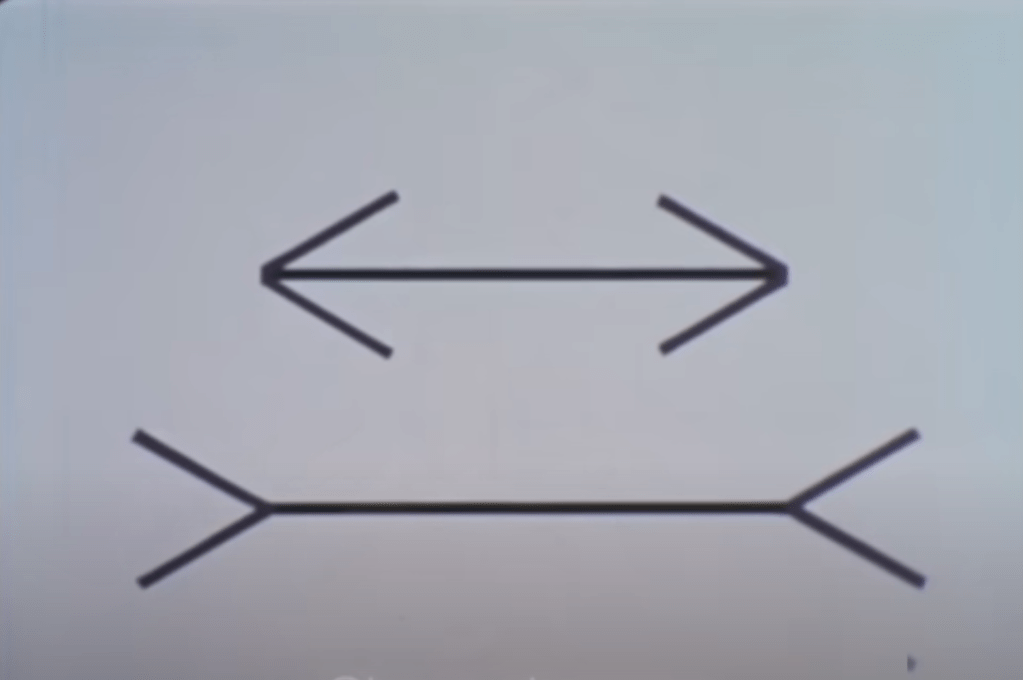
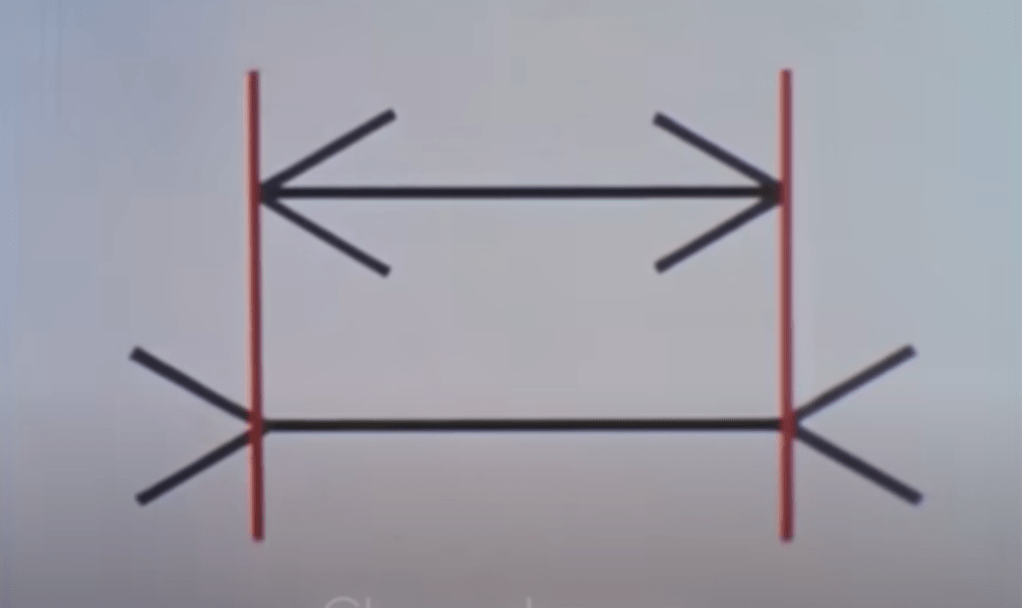
I spent all afternoon trying this out and it definitely works.
If you are struggling with makeup try this out.
Do one eye with a light colour and the other with a dark colour.
Have to say I wanted to do the dark version, but I didn’t suit it at all.
You might be the other way and suit the dark colour better.
The video is really accurate with eyeshadow, you need to opt for what suits you rather than what you like, if you are going for the optical illusion effect.
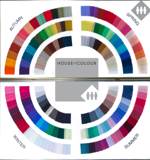
Seasonal Colours
Choosing colours in a pallette that are your seasonal colours.
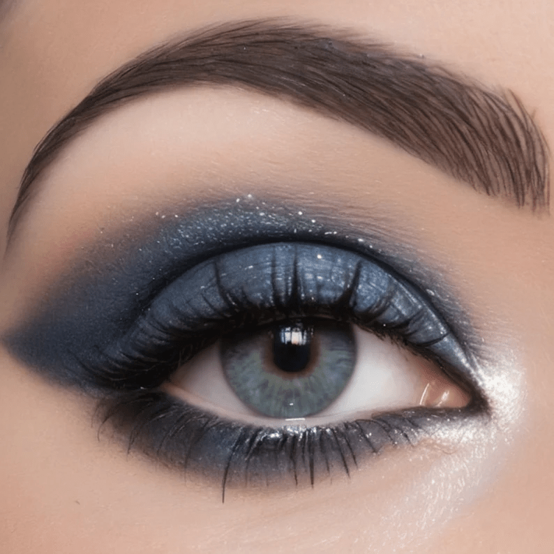
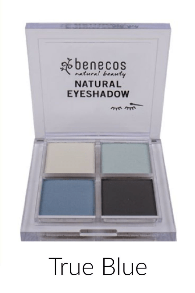
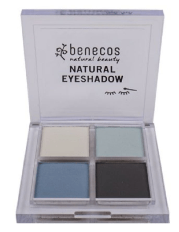
Got this palette to try so winter suits the white, light blue and black, but not the darker Sybil colour. Think that is summer.
If seasonal colours are accurate, I should suit the blue, silver and grey. But the dark blue is summer.
Complementary or Harmonising coloured eyeshadow
You can also take into account your eye colour.
Mine used to suit purple, now it is green.
When you look at your seasonal colour on the chart, the opposite colour on the chart should work well with your natural colours and create an optical illusion i’e’ Winter should suit it’s opposite colour which is spring.
This is fun as you can create lots of different makeup looks that all suit you.
Charlotte Tilbury Eye makeup to suit your eye colours
You can Harmonise or contrast.
This makes it easier as Charlotte has created the correct colours for you.
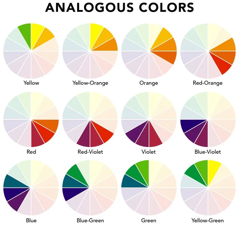
Harmonizing colors are colors that work well together to create a pleasing image. They can be found next to each other on the color wheel and are also known as analogous colors. A harmonious color scheme typically uses three to five colors that are next to each other on the color wheel.
Here are some tips for creating harmonious color schemes:
Balance warm and cool colors: Warm colors like red and yellow can add energy to a space, while cool colors like blue can create a sense of tranquility. It’s important to balance these colors to avoid creating a space that’s too stimulating or too cozy.
Color harmony is an important concept for artists and designers, who use it to create certain moods or aesthetics. It’s also important for consumer goods, where the right colors can help attract customers and enhance their experiences.
Google search
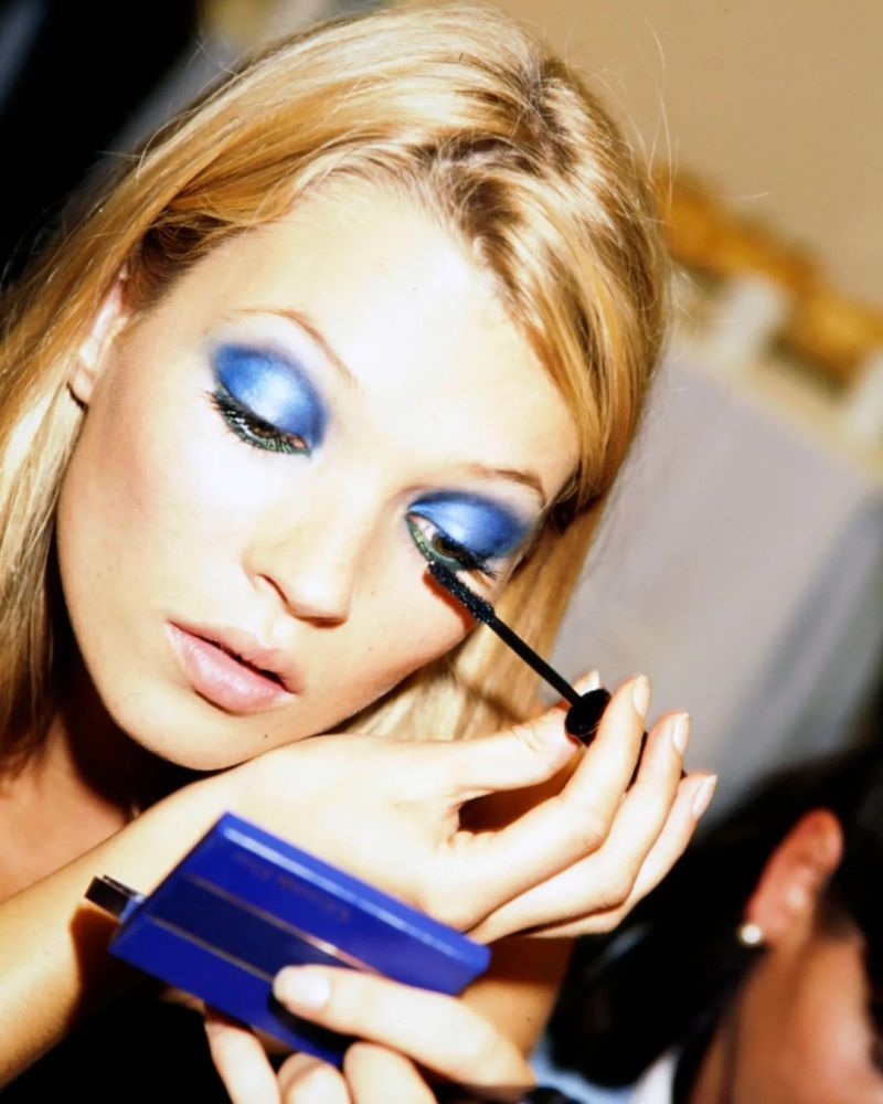
I’ve sent for the hazel one, I would have opted for the blue one which doesn’t suit me at all.
I had a junior makeup kit with green eyeshadow and red lipstick and loved the look.
The red lip compliments winter and the green eyeshadow.
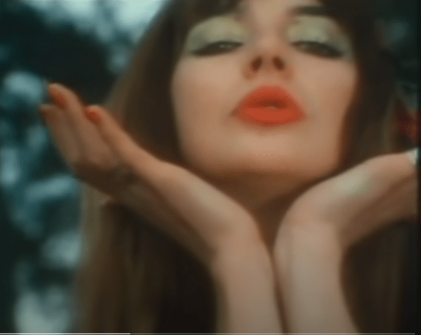
Kate Bush demonstrating Contrasting colours working, she just happens to be beautiful to start with. Love this look.
This is actually the vintage makeup look that the air hostesses would have worn in last weeks perfume junky.
I used to do this look when I shopped at Avon, I was told not to wear a lot of makeup and took no notice.
I used to use really deep bronzer, and might go back to doing that.
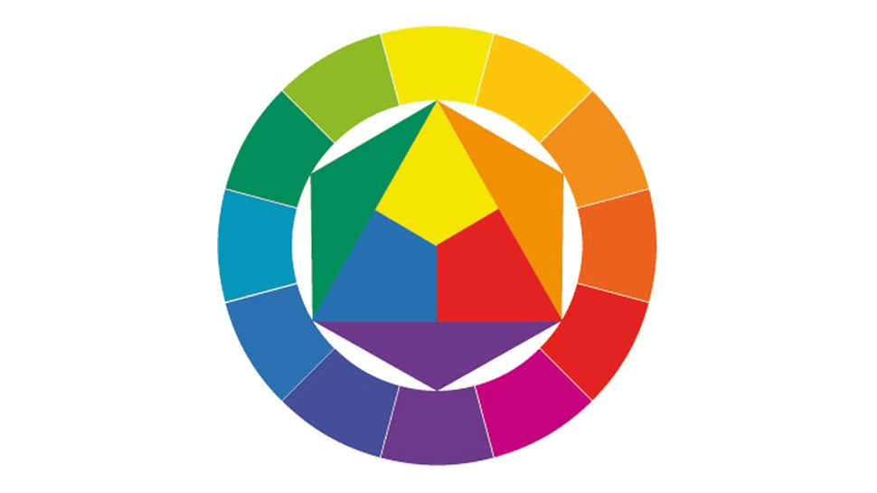
The colour wheel
(how it works)
Colour wheels show the primary colours (conventionally red, yellow and blue in painting) on the outermost ring. The secondary colours are created by mixing two primary colours – if red, blue and yellow are the primary colours, the secondary colours are green, orange and violet. Tertiary colours are then created by mixing a primary with a secondary colour.
Did someone use complimentary colours off the colour wheel for this look?
The colour wheel allows us to see at a glance which colours are complementary (opposite on the wheel)
The lipstick complements the eyeshadow.
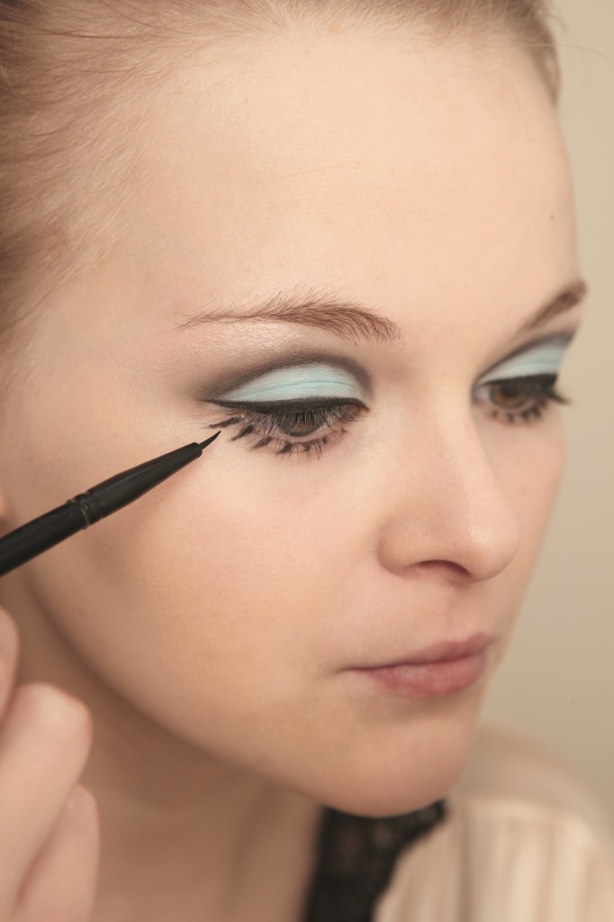
Even though the blue is fairly light it is quite powerful, so it is probably better to team it with a light lipstick and vice versa.
The peach colour is the complimentary of winter so it does suit winter.
Conclusion
As I’m a beginner at this, it has taken all afternoon to try out and write up part one.
Hope this helps you if you find tutorials go above your head and are a little too fast.
I’ve worked out a Halloween look by following these principles.
Haven’t got any peach lipstick though.
Pink goes with light blue, so will go this way with it.
Think this is harmonising as they sit next to each other on the colour wheel.
Found this in my journal so pink and blue seem to be a good way to go.
Had this bronzer from Avon. You could imagine her as an air hostess.
Will study the rest of the video in weeks to come.
The main thing I worked out here is the optical illusion with eyeshadow colours.
There is definitely similarities between makeup artists and artists.
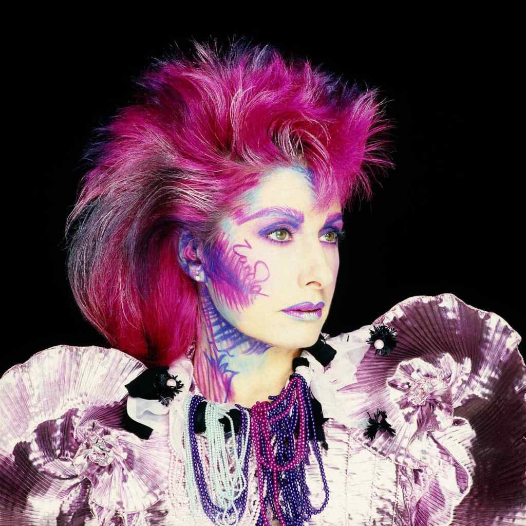
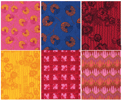
Looked on Instagram this morning and found the Queen of fabric design and pink and blue.
This is what I’m going to do.
Zandra Rhodes was one of my icons at design college. They had her book in the design library.
Think I’m better on a sewing machine than painting maybe.
Started making jewellery after we were illegally evicted which is my Halloween look. Made it in the hotel while we were waiting to get our keys back. Decided to do statement jewellery, unless some dresses are delivered in time, just got the dresses I’ve already worn. Good tip actually if you are struggling to get outfits too. You notice the jewellery and it makes the dress look different or new.
One of the reasons I’m not very good at painting is I’m heavy handed, discovered this is the trick to applying makeup properly also.
Hopefully my slow approach will enlighten us on the bits we don’t quite get.
There is quite a lot to take in just from the first few minutes..
Makeup artists obviously are very talented with a lot of knowledge and experience, so trying to get the same result at home when you have no experience can be a bit daunting.
Hopefully the more you do it, it gets easier, like defeat gravity lol!!!
Learnt quite a lot so far and have got a new interest in makeup.
If it goes wrong at first, guess this is the only way to learn.


1 Comment